
Our inboxes are full. The competition is stiff. What makes some emails better than others? How can your emails suck less be better?
There’s a lot we have to consider when 54% of all emails are opened on a mobile device*. And that number is only growing.
To help, we’ve put together an email marketing checklist. So until you have them all memorized, and trust us…you will, save this post.
Cheers to higher open and click-through rates!
1. Keep the subject line and pre-header short and concise.
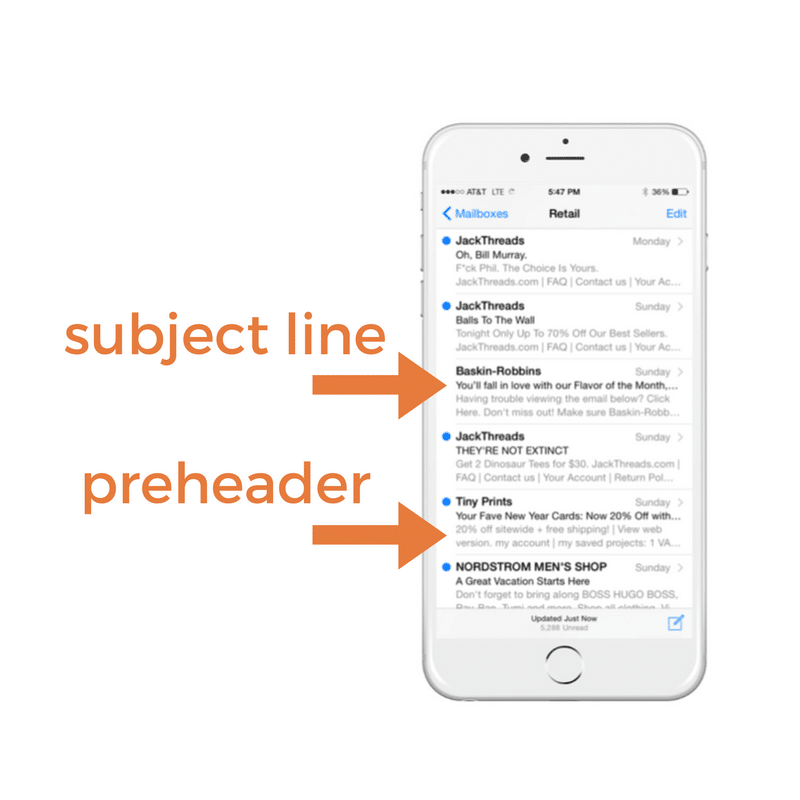
Think of the pre-header as another subject line for your email. Tips for writing:
- Keep the pre-header text different from the subject line – think of it as another way to entice people to open the email, get creative here
- Include keywords and get to the point with valuable facts and info
- Add a CTA (call-to-action)
- A/B test!
*And just because we like you, check out this list of 64 Email Subject Lines Which Get Great Results – courtesy of Creative Copywriter.
Ideal length for pre-header text: this varies depending on device but keeping it between 30-80 characters is a safe bet. Check out Litmus’ guide to preview text support.
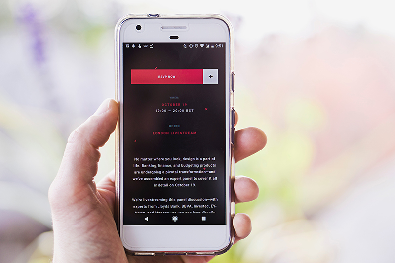
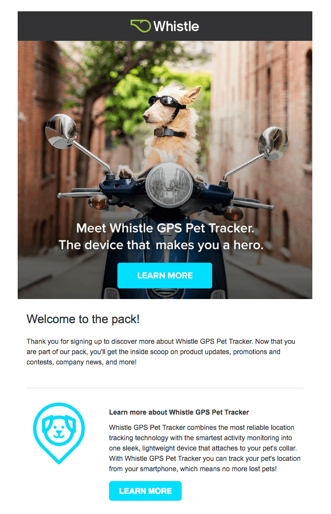
2. Don’t Confuse Your Subscribers. “Where do I click?”
Often, we include a main image in our email newsletters. Don’t confuse customers, they may not know the image is linked. Always include a CTA (call-to-action). Example below. Oh yeah, and never use the text “click here” because most of emails are opened on mobile now and no one is “clicking” with their finger, instead try “learn more” or “read more”.
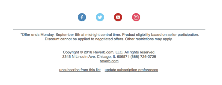
3. Social Icons & Making Good Use of Your Footer
A good place for social icons, hashtags, sale/promo details? The footer. Example below.
4. Design for MOBILE First!
Test the email by sending a test message to yourself first. Check it on your phone, then check it on other devices.
The pinch test: can you read it on your phone without pinching? No one wants to pinch. Also make sure it looks good in multiple email clients – Gmail, Outlook, etc.
80% of subscribers delete an email that looks bad on their phone. And 30% unsubscribe…*
The top 10 most popular email clients:
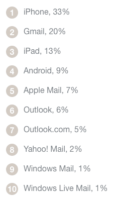
(source: Litmus 2016)
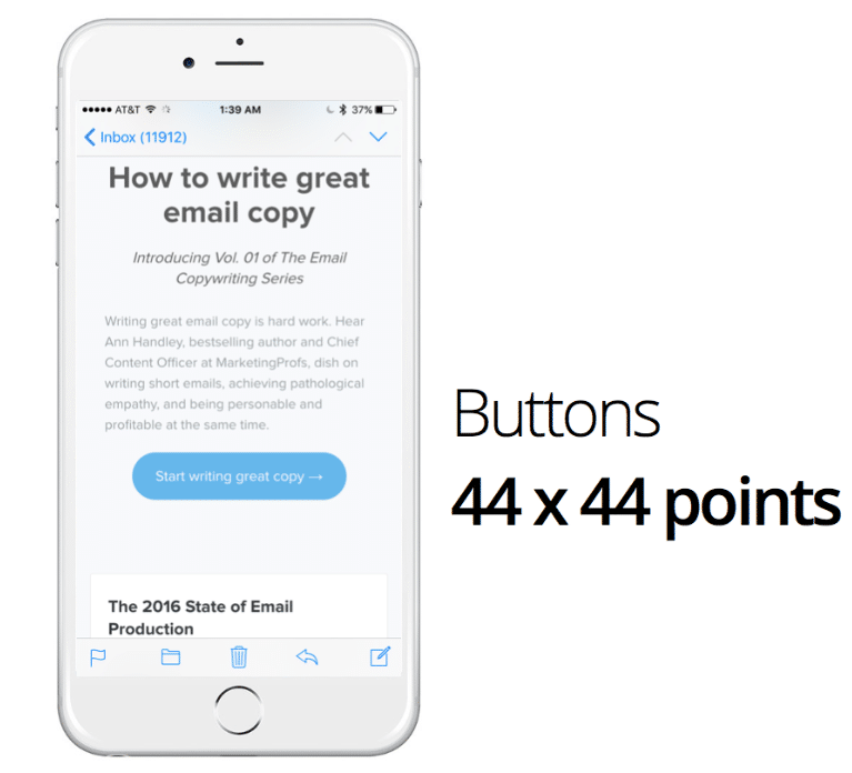
5. Fonts & Buttons
Helpful numbers to keep in mind when creating your email newsletter:
Body font: 16- 18px
Headlines: 24px +
Buttons: 44px x 44px (perfect size for finger)
White space: 40px +
6. Images
Please, for the love of all things, never include an image with embedded text that your mobile readers cannot see. A good rule of thumb: when embedding text on a photo, never go smaller than 42px for a headline.
7. In a Nutshell: Keep it Simple. Get to the Point.

Need a little inspiration? Check out Really Good Emails.
*source: Litmus
*iPhone image credit: Michael Barber